|
We were asked to create a logo and make 3 variation for each of them. And once we are finished with making three variation, we were asked to go to the teacher and get approved. Something that was frustrating was writing out the letters. Because once I wrote the letters, it got smaller by itself. And when I tried it again, it did the same thing. So this was the most frustrating part for me because the letter kept changing shape. My favorite thing about this process was making variation. When I made these variation, it felt like they were the same logos, but they each had different personalities and variety. It was really interesting to do. I learned that you need to sometimes be patient with technology, and that vectorizing logos isn't a easy thing to do. I also learned that making logo includes hard work and creativity because without creativity, you can't be able to make a logo that represents your company! 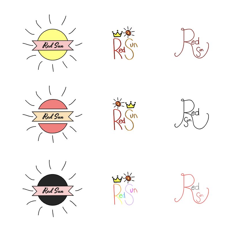 My brand is called Red Sun, and it's a soft drink company. And this logo represents the popping of the soft drink because the sun king of looks like it's popping, and I wanted to also show that in a you can drink it a hot day. And I chose this as my final logo because I liked how it included the crown which makes it look more eye catchy. And since the word is easy to read and it still shows the sun and the crown, I thought that this would be the best logo to choose. And overall I really enjoyed making this logo and it brought my creativity back to life! 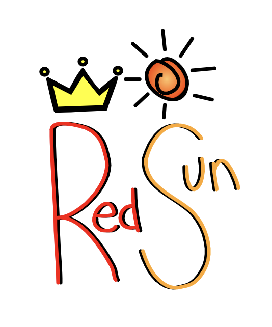
0 Comments
Leave a Reply. |
Archives
May 2019
Categories
All
Click to set custom HTML
 This work is licensed under a Creative Commons Attribution-NonCommercial-NoDerivatives 4.0 International License. |
