  I really enjoyed making this webpage, and I learned many things doing this. But one challenge was that if a single code was putting them in order. I would get confused where to put them. But overall this assignment was really fun!
We were asked to create a logo and make 3 variation for each of them. And once we are finished with making three variation, we were asked to go to the teacher and get approved. Something that was frustrating was writing out the letters. Because once I wrote the letters, it got smaller by itself. And when I tried it again, it did the same thing. So this was the most frustrating part for me because the letter kept changing shape. My favorite thing about this process was making variation. When I made these variation, it felt like they were the same logos, but they each had different personalities and variety. It was really interesting to do. I learned that you need to sometimes be patient with technology, and that vectorizing logos isn't a easy thing to do. I also learned that making logo includes hard work and creativity because without creativity, you can't be able to make a logo that represents your company! 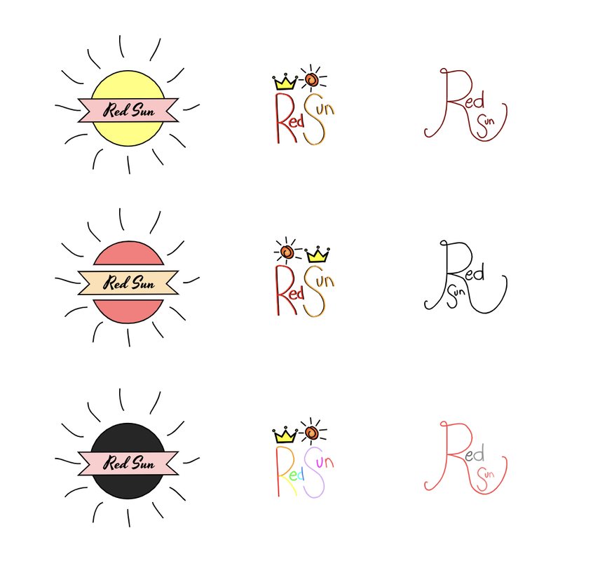 My brand is called Red Sun, and it's a soft drink company. And this logo represents the popping of the soft drink because the sun king of looks like it's popping, and I wanted to also show that in a you can drink it a hot day. And I chose this as my final logo because I liked how it included the crown which makes it look more eye catchy. And since the word is easy to read and it still shows the sun and the crown, I thought that this would be the best logo to choose. And overall I really enjoyed making this logo and it brought my creativity back to life! 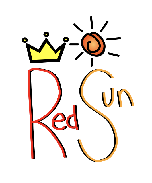 I chose these three logos because I felt like some have to be simple and some can be a little fancy. These represent the sun/drink because my company is a soft drink company. I really enjoyed making these logos. I felt like a person actually making a company. I really enjoyed drawing these logos because it brought me creativity out of my brain. :) So far, I think that the logo project is turning out well! 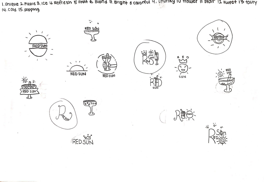 In this assignment we were asked to create four different color palettes including :
We used a site called Adobe Color to help us with this assignment. The color schemes that we learned are monochromatic, analogous, complementary and triadic. Monochromatic :
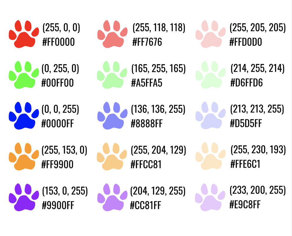
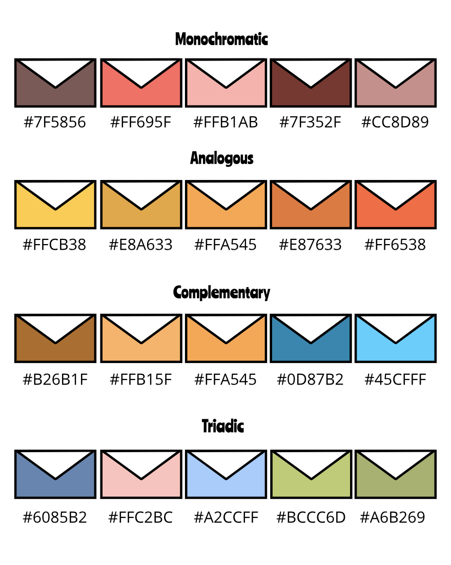 In this assignment, we were asked to create a piece of work that displays at least 15 colors. It can be a simple set of shapes with different colors or a piece of artwork with different colors. You have to either create the illustration, or trace a artwork from the internet and give credit. We have to include the following :
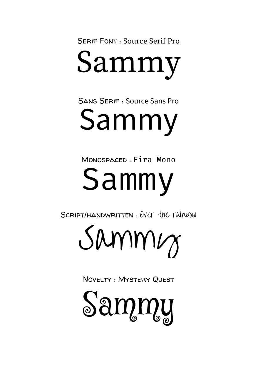
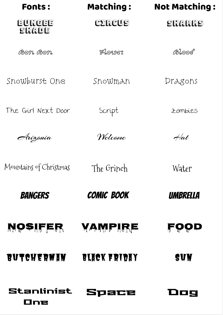
 Definition of Typography : the style and appearance of printed matter. I think it's important because it can represent different kind of style of words. The quote, "Each font has a personality and a purpose." Means that all of the fonts are used different according to their style. We learned about Serif, San Serif, Mono Spaced, Script/Handwritten, and Novelty.
Typeface ComparasonWe were instructed to create a gravit document that includes the 5 web fonts :
 Word PortraitsIn this activity, we were asked to create a document in gravit; in A4 size. The instruction was to create a document including the following :
 |
Archives
May 2019
Categories
All
Click to set custom HTML
 This work is licensed under a Creative Commons Attribution-NonCommercial-NoDerivatives 4.0 International License. |